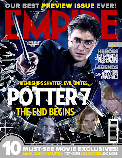
"Empire" is a well known film magazine that appeals to its target audience of young adults because of its bright colours and its well known modern, box office actors and actresses.
On this front cover of "Empire" the main image is of Daniel Radcliffe who is playing Harry Potter in the first part of the finale of the famous films written by J.K Rowling. This front cover has a variety of different elements to it the make the magazine appealing to the target audience.
Masthead
The masthead of this film magazine is partly blocked out by the main image on the front cover. However, the magazine is still recognisable by the target audience because it is such a well known film magazine. However, this masthead doesn't stand out from the page because of the dark background. The dark background and the red masthead don't contrast with each other, they just blend in do that the masthead doesn't stand out to the target audience as much as it should. This will make the magazine less appealing to the target audience because the masthead isn't as recognisable on the dark background.
Main Image
The main image of this front cover has direct address with the target audience, not only with the large main image, but with the smaller images that are related to the main image as well. This makes it more appealing to the target audience because it allows the main image to connect with the target audience so that they want to read the magazine articles more. The main image also represents what happens in the film as the 4 main characters are on the front cover and it also shows broken glass which represents destruction. There is also a small piece of text on the left hand side of the image that explains what film the image is about.
Skyline
The skyline on this front cover of "Empire" brags about the magazine and the articles that this issue contains as it says, "Our best preview issue ever!". This tells the target audience that there is going to be a big section of the magazine about the preview of the new Harry Potter film. This allows the target audience to know what is going to be featured in the magazine without having to open the pages of the magazine. The skyline at the top of the page is also in bright colours and this makes the features stand out to the target audience. However, the skyline at the bottom doesn't stand out as much but does have its own section of box of the front cover so that the text doesn't get jumbled up.
Anchorage Text
The anchorage text on this front cover is centred in the page so that it is the first text that the target audience sees, this is important because it is the feature that will make the magazine seem appealing to the target audience. The anchorage text on this front cover is white and this stand out against the main image and the background because it is so bright and contrasts with the other colours on the page. The anchorage text also has additional text to explain and support the anchorage text and the main image.
Sell Lines
On this front cover for "Empire" the sell lines are put into categories so that the target audience can easily locate what articles they are interested in. However, there aren't many sell lines on the front cover to make the magazine seem more appealing to the target audience. The colour of the sell lines makes them stand out from the rest of the page, however, the size of them is rather small and this could mean that they are hard for the target audience to read.
Layout and Colour Scheme
The layout of this film poster is quite hectic and there isnt a set order to the text, they just seem random and all over the place, especially with the sizes. The main layout is dominated by the main image rather than the text that makes the magazine seem appealing to the target audience. However, the colour scheme of the film magazine contrasts as there are both dark and bright colours, this makes it eye catching for the target audience as particular features stand out from the page.

No comments:
Post a Comment